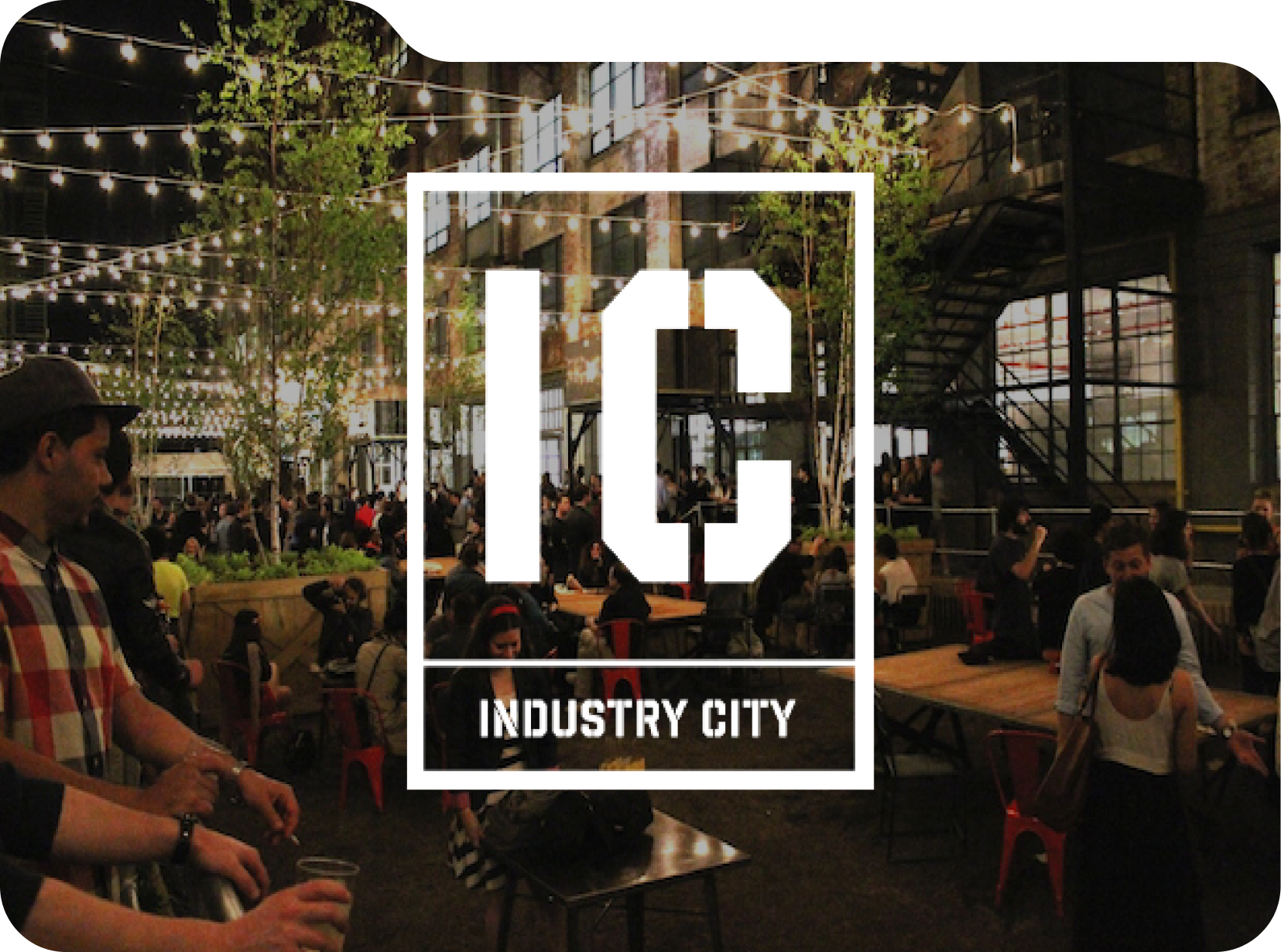
Industry City
Project Type
Real Estate Leasing & Information
Date
November 2016
Contribution
Web Dev, UX Design, UI Design
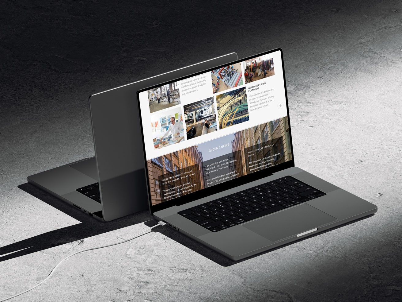
Located in Sunset Park, Industry City is an innovation ecosystem for tenants and the neighboring community. With 35 acres of sprawling waterfront property, Industry City is a small city within the borders of the big city.
Introduce the next big micro-city in Brooklyn. Merging business with culture. Highlighting leasing spaces for a co-working / community hub.
Working with a team consisting of a graphic designer and another developer, our goal was to create a website to drive tenant sales to the property. My role for this project was to design and develop the site utilizing the sitemap the previous designer had constructed. Once I conducted a competitor analysis and gathered client given material I got to work sketching out wireframes for the responsive site. Utilizing the Wordpress visual editor, I built the site using the native tools and writing custom CSS & HTML.
Challenge
Sunset Park located in Brooklyn is not a short commute, how can the audience be persuaded to move their business to this new "city"?
Solution
Prospective tenants are drawn to shared work spaces that have unique perks and communal integration.
The challenges and barriers to filling the tenant pool
Although the founders aim to attract more artists and entrepreneurs to rent out space, their primary focus is on capturing those already choosing local co-working community spaces. As a result, the goal was to understand the preferences and challenges of this market segment. We initiated the discovery phase with interviews and research on what the property had to offer to incentivize others to check out the space.
Key Takeaways
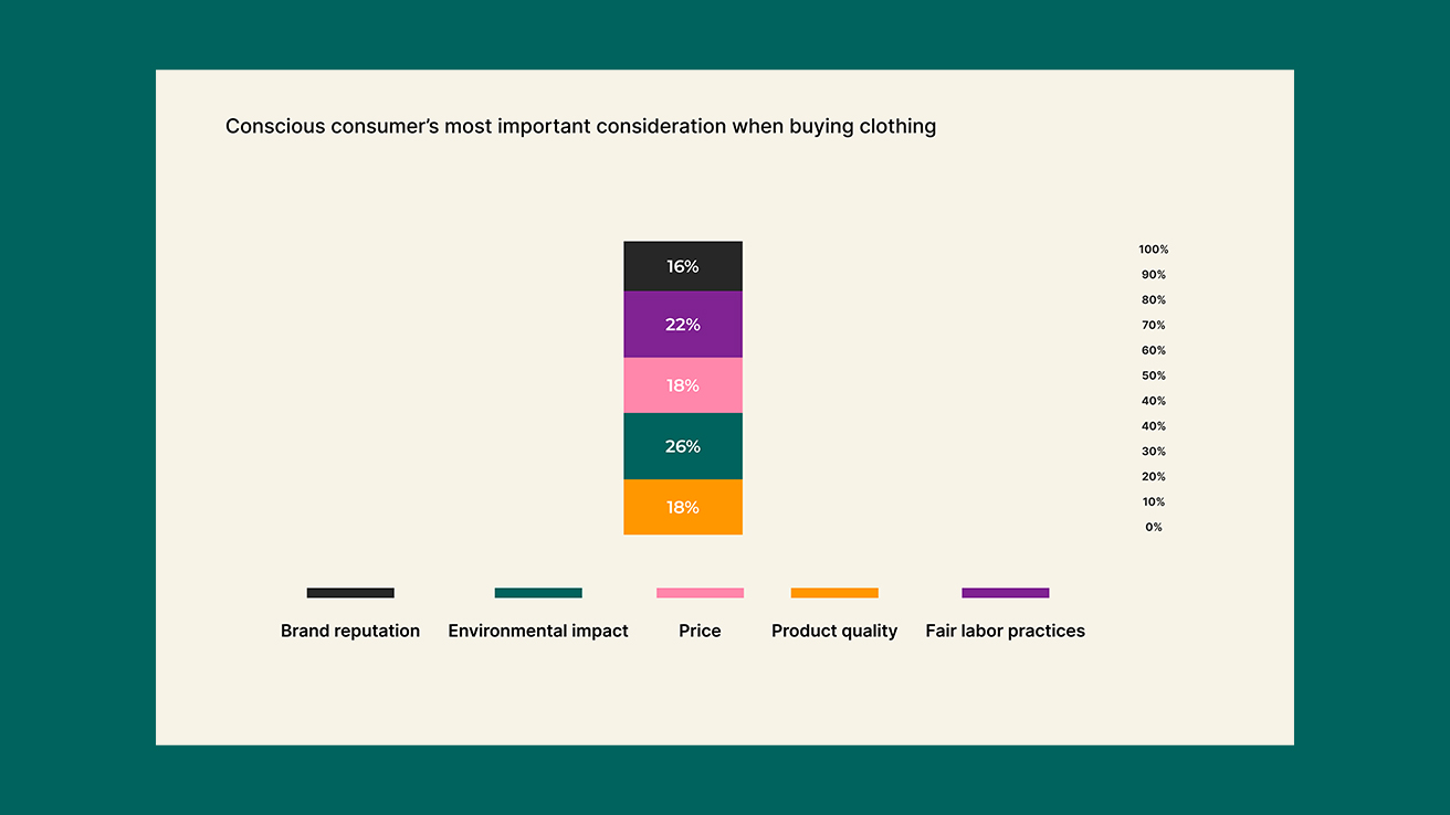
Desire for Transparency: Consumers express a strong preference for transparency regarding the price and ameneties offered.
Importance of Price and Quality: While perks is a key consideration, consumers also prioritize factors such as price and commute distances when moving spaces.
Essential Website Features: Consumers identify clear descriptions, detailed information on leasing structure, current tenant testimonials, calendar of future events, and assurance of essential features when shopping for leasing spaces.
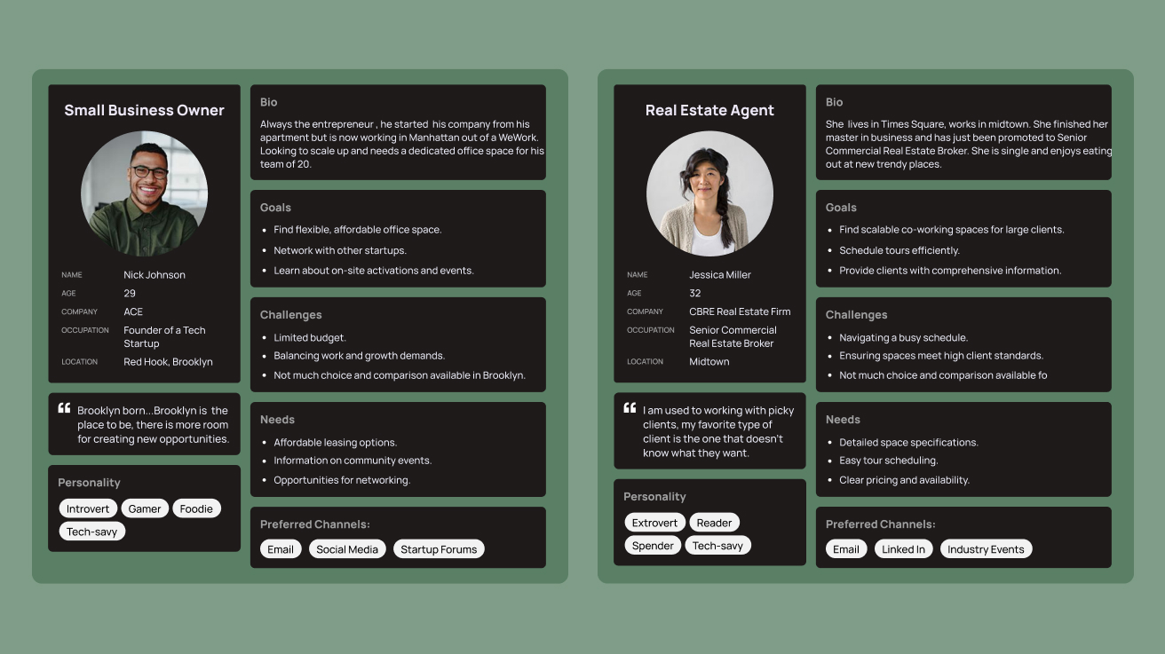
Using the information obtained during the initial phase, I developed customer personas to understand the target audience for Industry City. These personas outline their diverse goals, needs, and frustrations when shopping for responsibly made clothing.
Providing transparency and brand distinction while elevating product appeal
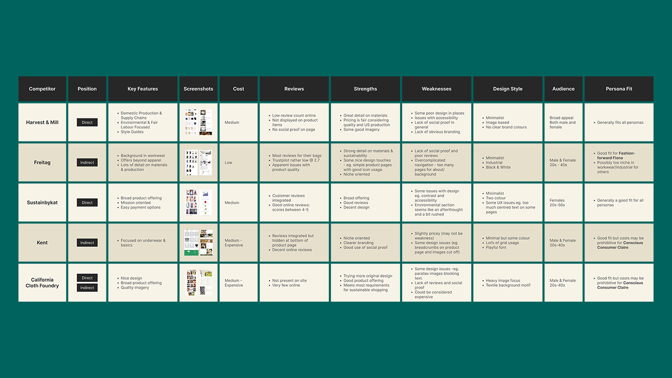
After conducting interviews and surveys, I proceeded with a competitor analysis to gauge how other brands in the sustainable fashion sector were addressing consumer needs and positioning themselves. I selected five businesses offering compostable clothing and scrutinised their online presence to identify strengths, areas for improvement, and potential opportunities.
My analysis uncovered several shortcomings among these brands. Many lacked a thorough explanation of their sustainability claims, merely mentioning sustainability without substantiating it. Additionally, a significant number of brands neglected to include customer reviews, despite their importance to consumers. Surprisingly, the majority exhibited poor website design and accessibility issues, such as readability problems due to clashing colors. Furthermore, their branding tended to be generic, characterized by minimalistic aesthetics and soft tones, making it difficult to differentiate between them.
Combining all findings from the research phase, the new website requires clear information to back up sustainability claims without detracting from showcasing the clothing quality. At the same time there is a real opportunity to differentiate by doing something different in a market saturated with bland branding.
Designing an experience that builds trust
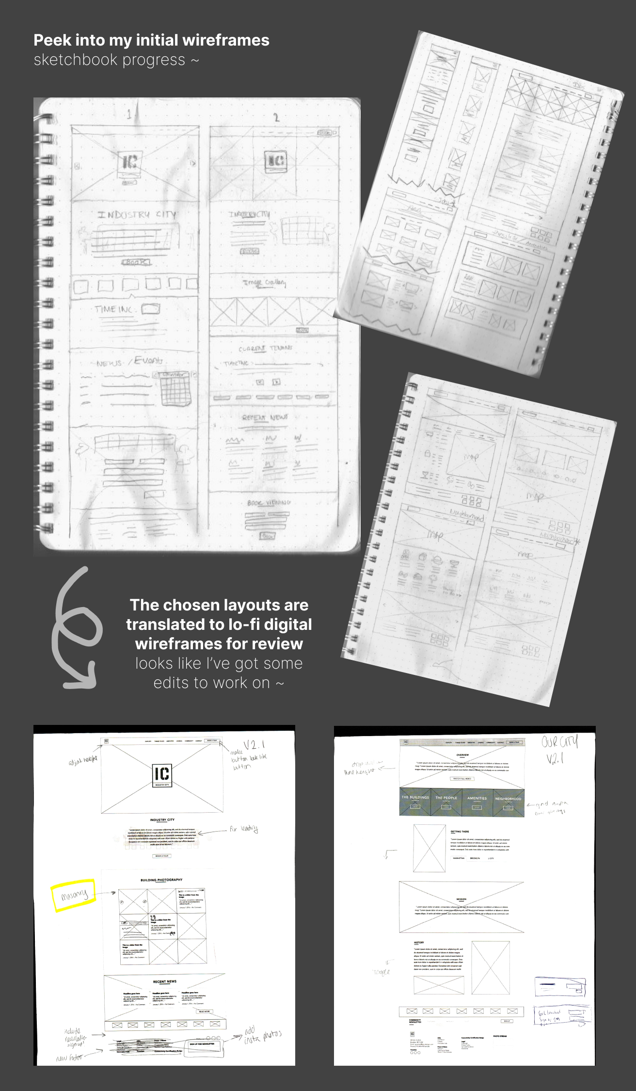
I initiated the design process by sketching and creating low-fidelity wireframes, experimenting with various layouts and content formats. A key emphasis was on effectively presenting the brand's mission and substantiating its sustainability commitment without overshadowing the products or disrupting the shopping journey.
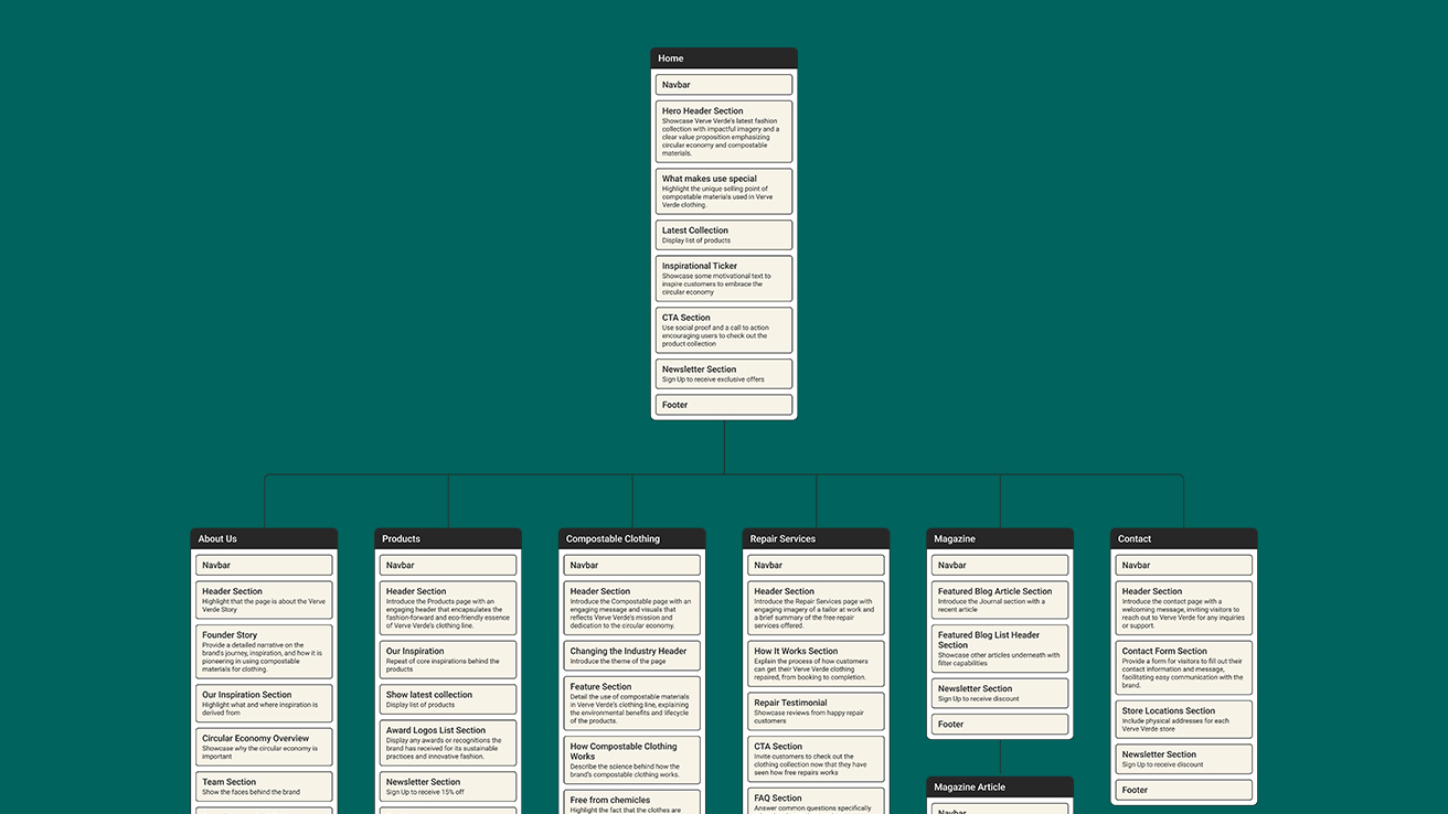
After iterating on various designs and incorporating feedback, we concluded that creating dedicated pages for topics such as the compostable clothing process and showcasing initiatives like free repairs would be essential. This approach allows us to maintain a focused product page, highlighting the brand's quality clothing offerings.
I created a sitemap and high fidelity wireframes before moving on to consider branding and design style.
A vibrant and playful website that's serious about the brand's mission
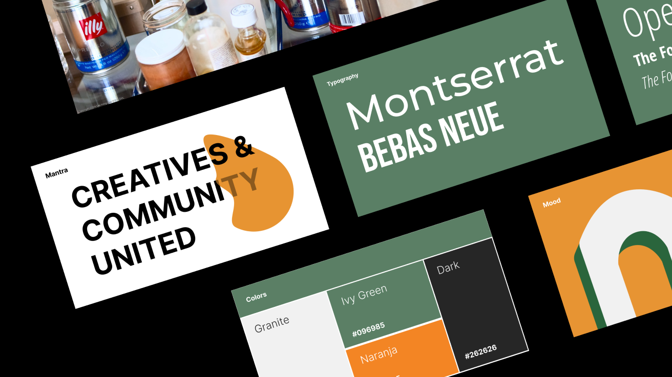
After finalising the website architecture and layout, I delved into exploring various design styles. Considering the founders' desire for a youthful feel and the prevalent minimal branding in the competition, I leaned towards eye catching styles. While initially considering embracing Y2K elements, I ultimately decided to incorporate aspects of Neobrutalism to ensure the brand stood out and aligned with the brief for a fun and distinctive aesthetic.
I created a mood board to capture ideas and and curated a vibrant color palette centered around the brand's core green. For typography, I opted for a combination of Syne and Inter fonts. Syne adds a playful touch to headlines, complementing Inter's excellent legibility and ensuring cohesive visual appeal."
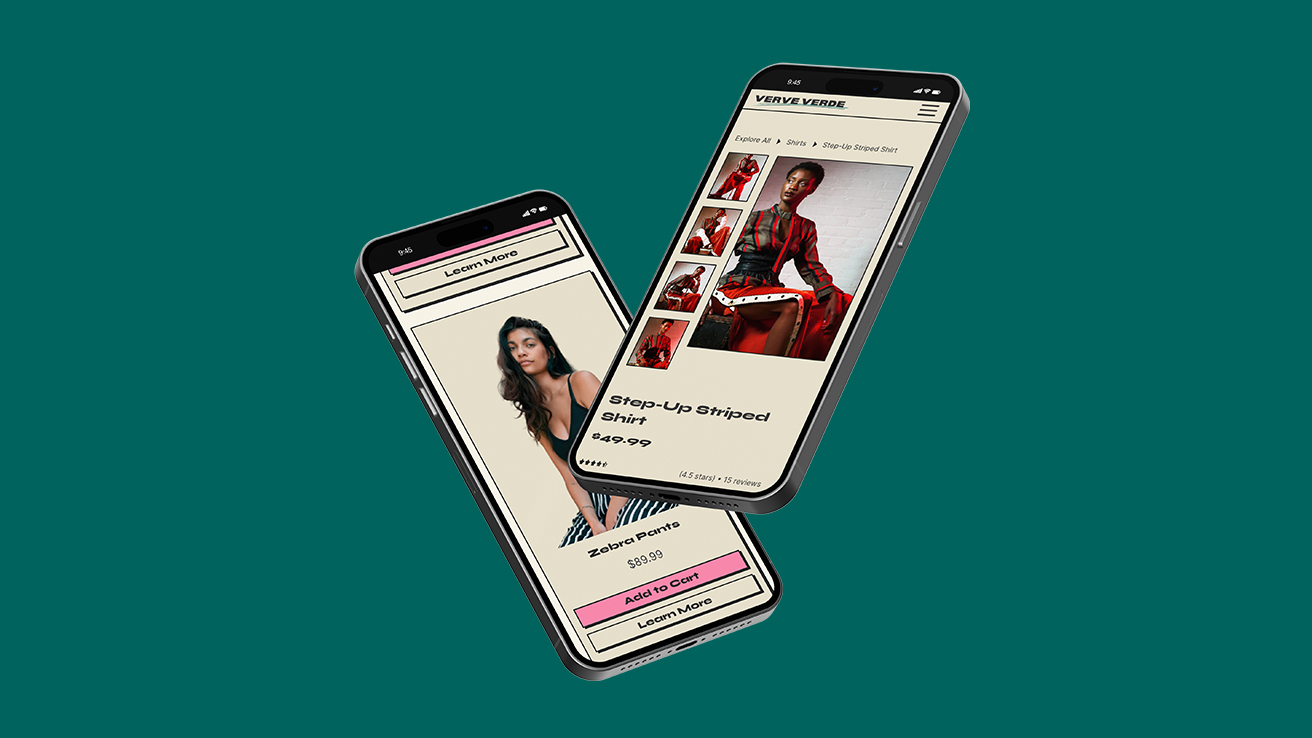
A comprehensive e-commerce solution for sustainable shoppers
Building upon extensive research into the preferences and challenges of environmentally conscious consumers, I designed a comprehensive website solution for Verve Verde. The website is set up to empower users to make sustainable choices by providing clear product information, transparency on materials, sourcing, and labour practises. Through user-friendly navigation and intuitive design, the website guides visitors through a seamless shopping experience, while strategically placed calls-to-action facilitate users moving from interest to purchase. Verve Verde's commitment to sustainability and circularity is showcased throughout the website, reinforcing the brand's authenticity and resonating with environmentally conscious consumers.
Problems Solved
Lack of transparency regarding materials and sourcing in the fashion industry is addressed with very detailed pages on compostable clothing and the free repairs service.
The website showcases initiatives like free repairs, demonstrating Verve Verde's commitment to quality and durability, distinguishing itself from competitors and providing added value to customers.
Strong presence of customer reviews as preferred by consumers.
The website features user-friendly navigation and intuitive design, ensuring a seamless shopping experience for all users.
The new website provides clear and detailed product descriptions, with additional information about sizing and product care, empowering users to make informed choices about sustainable clothing.
Straightforward path to purchase with frequent and distinctive call to action buttons.


-poster-00001.jpg)

Other Works
INDUSTRY CITY
Website redesign for a funky, repurposed Macy's warehouse - bringing creatives and community together in Brooklyn.
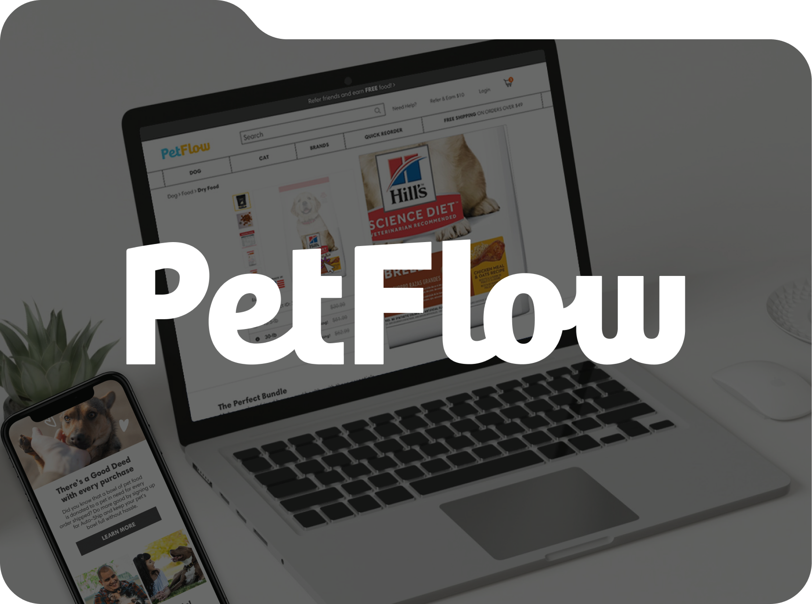
PETFLOW
Revamped UX/UI design for a direct to consumer pet e-commerce website.
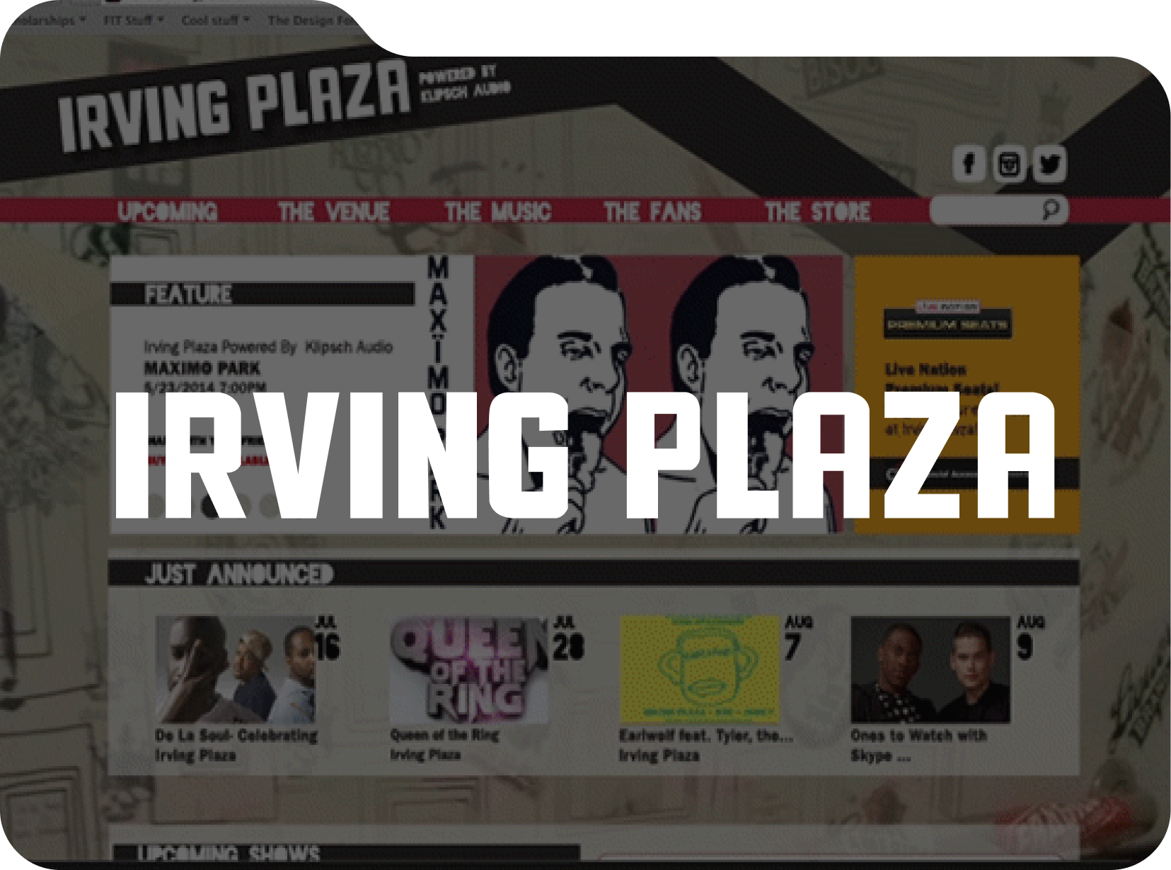
INDUSTRY CITY
Imaginative marketing and website redesign for one of New York City's legendary music venues.